Category

Blog

The Architect’s Way

By Blog

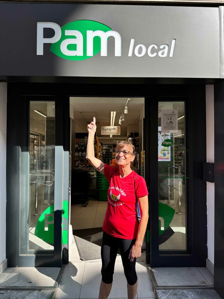
I turned 65 in December 2023, and I really started to think about what that means. I’d been doing succession planning and having conversations with other business owners, especially in my Women Presidents Organization chapter, and realized that I do not want to retire. I love what I do, and I don’t want to phase out or sunset. In fact, I want to do just the opposite. 

I’ve been calling 2024 “the year of Pam.” I know that sounds weird, self-absorbed, and probably not the right way to say it. I think what I really mean is that I want to continue to grow in all the expansive ways. I still want to learn all the time. That’s what is at the core of everything for me. That includes learning about me. 

At the end of last year, there was a lot happening in my personal life. I felt…stuck. I started to really dive into Transcendental Meditation. Well, not dive, it’s too simple to call it diving. But simple does not mean easy. Not at first. My mind would wander to literally every other place than in the moment, and so it took, and continues to take, practice. With TM, you’re not clearing your thoughts from your mind. Instead, you focus on a mantra (a word or phrase that becomes the object of your attention) and for 20 minutes, you direct your consciousness to that mantra. Every day. It becomes a practice. And an emptying. It’s something I look forward to most days. 

On the heels of venturing into meditation, I signed up for a women’s yoga retreat to Costa Rica. I hate yoga. Or that’s what I’d convinced myself of. What I hated was the stillness and the breathing. I am a die-hard fitness junkie, always moving, always going hard. That’s not what happens with yoga. And the retreat, which was led by Ilana Siegal of Lifeworks Studio, was so much more than yoga. It was deep healing and I wanted to continue that journey after the plane landed back in the states. 

After several people recommended it to me, and because I had such a transformative experience in Costa Rica, I decided to take a 13-week course, “Get Out of Your Own Damn Way” (perfect title, let me tell you), that Ilana also teaches. The entire course is based on The Artist’s Way, by Julia Cameron.  Through the course, I started journaling. 

I’m going to say that again. I, Pam Sandler, started journaling. 

Let me tell you, writing was something I never did. I avoided it at all costs. This time though, I was spilling all over the page (and “spilling” is my nice way of saying emotional vomiting and other splattering). I wanted to write. I WANT to write, so I do. No editing as I go, just writing. 

I also started to sketch again. You’d think that, as an architect, I’d be sketching all the time. But I mean sketching for the sake of sketching. You just start. Every morning, I sketch for six minutes. At first, that was a nightmare. A lot of those early sketches ended up in the trash because I didn’t like them. They weren’t perfect. But I realized, the whole point is not to perfect, but to process. To be in those six minutes, just performing the act of sketching and enjoying it for what it is. I’ve also rediscovered the joy of exploring art, painting, and color. Even in my presentations to clients, I’ve gotten more creative with how the presentation conveys not just the aesthetic and design of the project, but the artistic energy of it. I want to help them feel it as much as I want them to see it. I recently met with a young couple about a project. They have a child, just a baby, and as we were talking through ideas for the space, I was able to see, thanks to my own 65 years on the planet, more than 35 of those years in the industry and nearly as many years raising my own children, how the plan needed to grow with the family. A lot of the conversation was “Have you thought about…?” 

In my home life, I’ve made some of my own adjustments. I got rid of my TV. Instead of picking up dinner on my way home from the office and eating it in front of the television, I get home, put on music that I like and cook something nice for myself – very simple cuisine right now. My friends wouldn’t have believed that if my life depended on it! – set my own place at the table and enjoy my simple cuisine. 

These small steps have led to something bigger. They’ve set me free to do anything I want. It sounds hokie, and it is, but this is a new beginning for me. I’ve been able to really home in on causes and organizations that I’m passionate about and want to support in meaningful ways. I’m able to be a mentor to the young people in my firm, and to my sons, and anyone who asks for advice or guidance. I feel the purpose of that in my life. 

Not surprisingly, this week’s theme in The Artist’s Way series was all about enthusiasm. I’m going to Iceland in the fall to see the Northern Lights. How’s that for enthusiastic? 


The Berkshire Edge: A minimalist condo with maximum light

By Blog, Press

We often referred to this project as the “house of glass” because there is glass everywhere.

BY PAMELA SANDLER
Originally published in The Berkshire Edge on May 10, 2024.

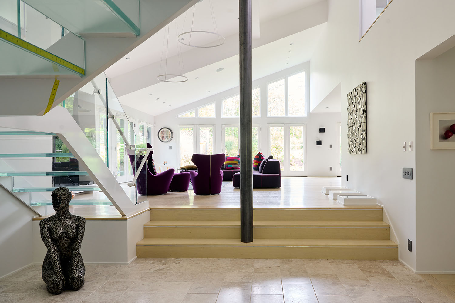
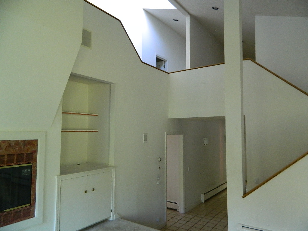
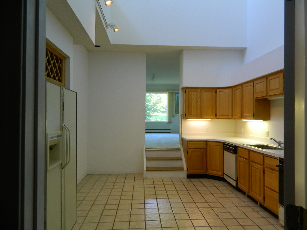
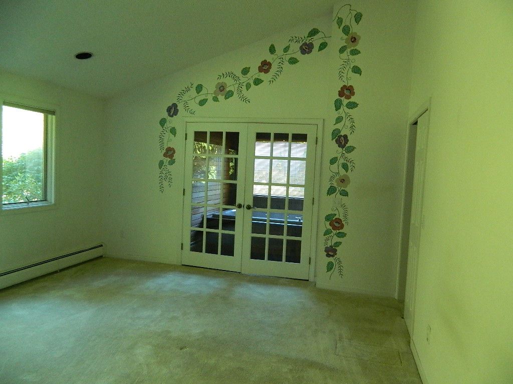
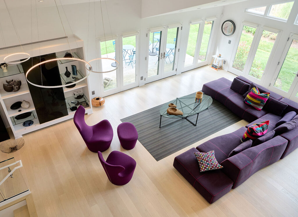
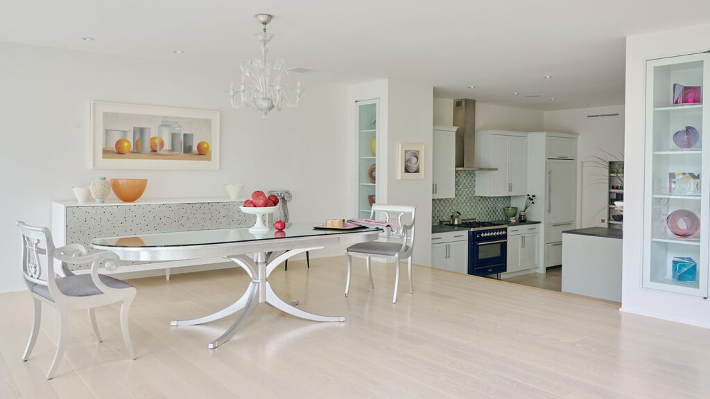
Condominiums are tough. When I was just starting out in the Berkshires, one of my earliest jobs was a condo back when condos were not “a thing” here. Obviously, a lot has changed since then. But what hasn’t changed is the limitations of condominiums, and this one was no exception. It was very chopped up, typical late 1980s design. We couldn’t make any structural changes to the exterior, so we had to utilize the space we already had. That included the screened-in porch, which we brought into the square footage of the house, enclosed it, and it became the main living space. Multiple French doors—French doors everywhere, really–and angled windows (all custom, and cut flush with the roof line) opened the space up tremendously. That was one of the main goals our client had. Even when you are inside the living room, you feel like you are outside because of all the glass and light.

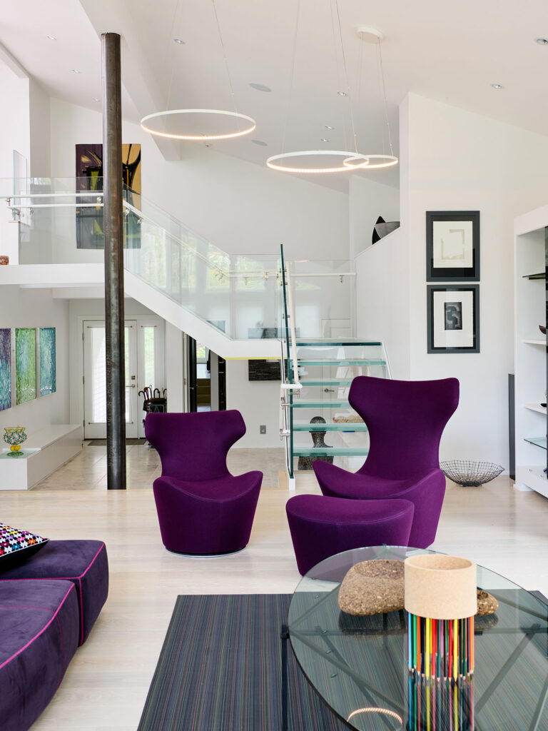
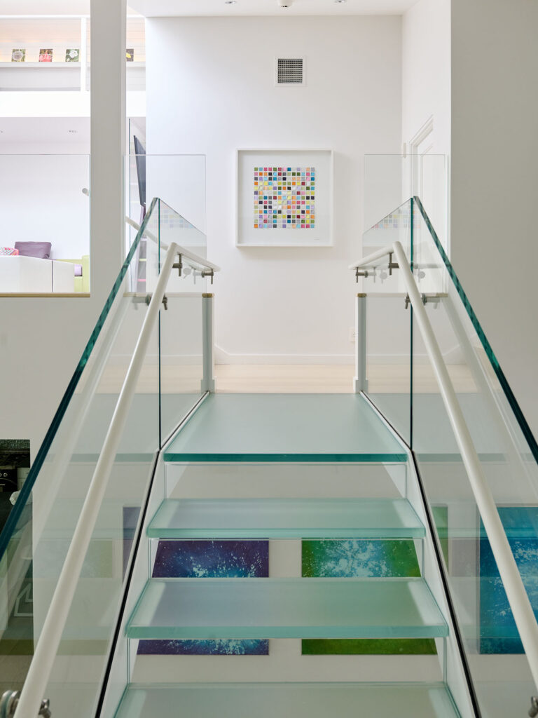
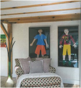
In fact, we often referred to this project as the “house of glass” because there is glass everywhere. The windows, the doors, those are the obvious features. But then there is all the glass detail. Tiny, tiny glass tiles in the kitchen, concave and convex glass tiles in the bathroom, plexiglass stairs and glass risers, frosted glass cabinets; no view inside or out is obstructed. In fact, glass is the true “canvas” for our client’s expansive art collection. So expansive, that we catalogued the art before we began the build and afterwards hired someone specifically to hang the art.

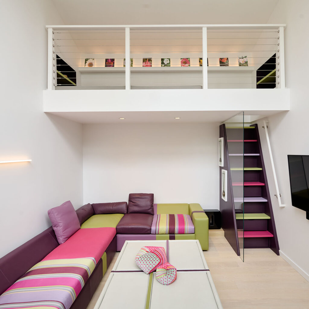
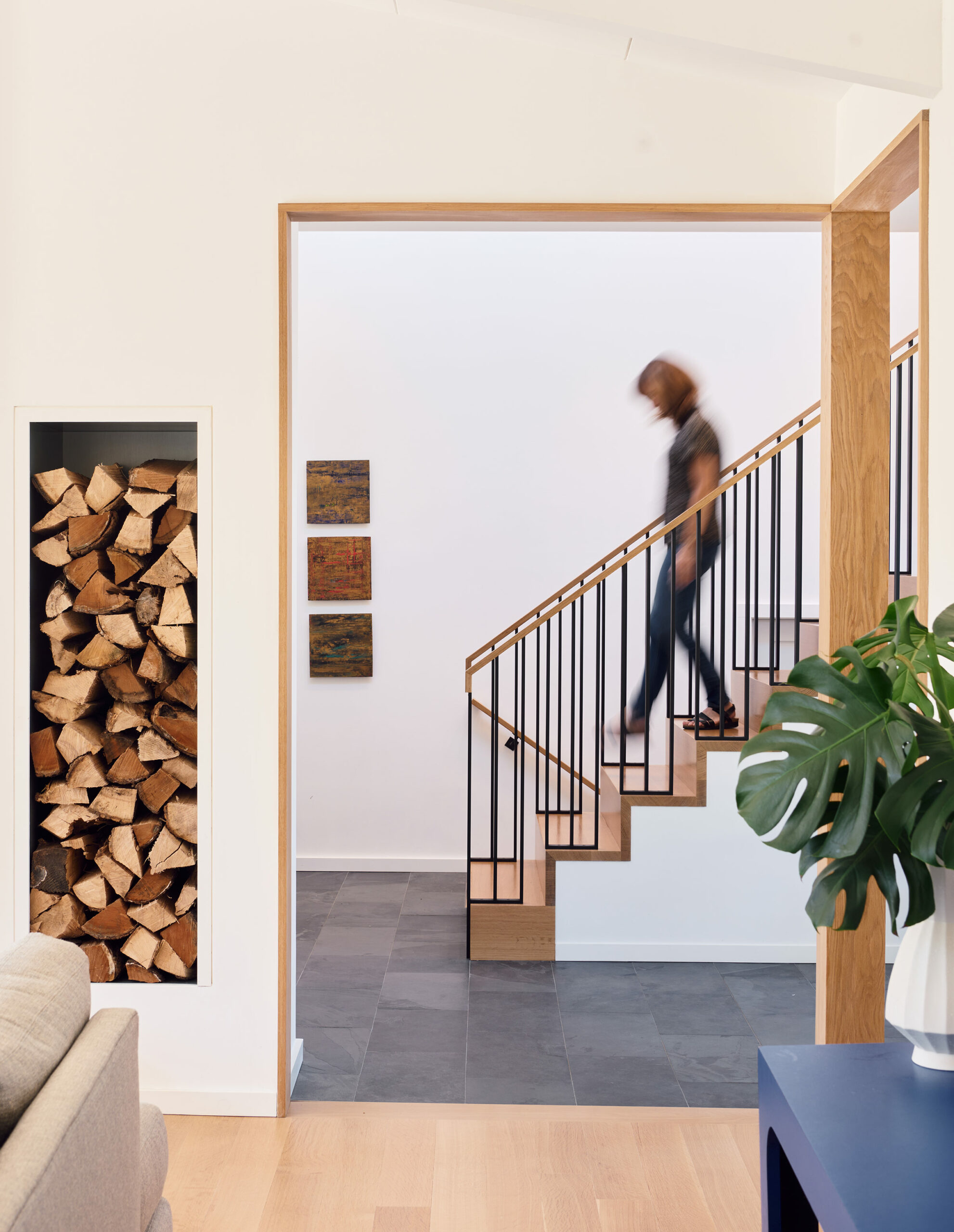
Everything is custom built. Everything. Glass shelves are backlit and filled with sculpture and other art. We made light boxes for specific pieces, and when younger, more curious guests would come (the kind who can really do some damage to glass), we designed wooden panels to cover the light boxes…just in case. Every corner of this house is a curation. A vignette that you discover as you wander through. And, of course, the stairs, which are central to the entire space. We’ve started calling them the “Pam stairs,” as they have turned up in subsequent projects. (I am mildly obsessed with stairs. My team and my kids might argue more than mildly.)
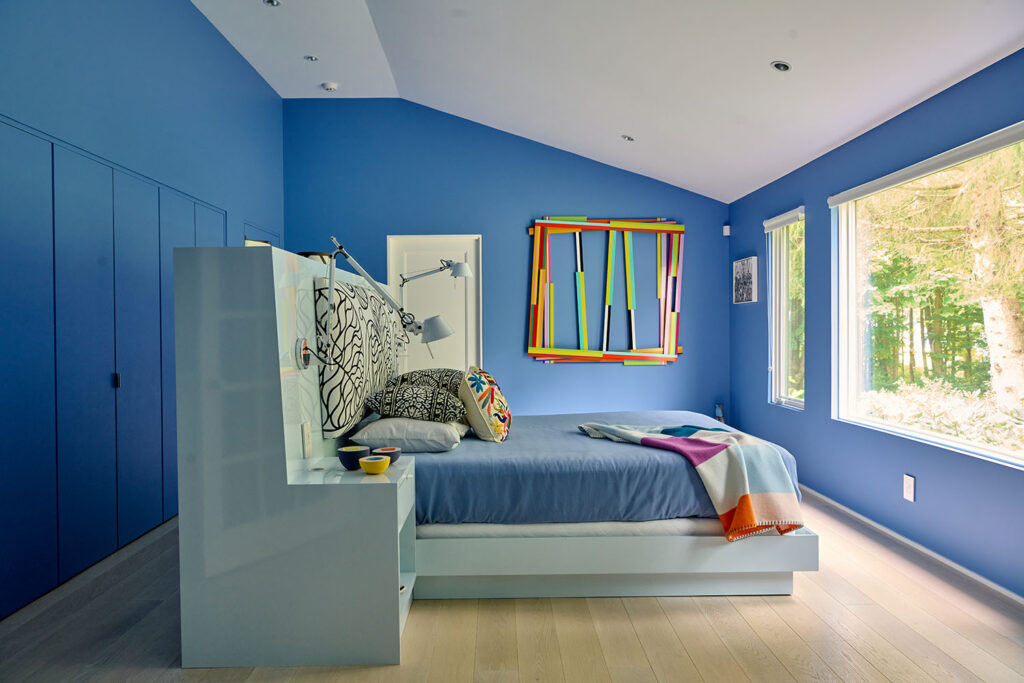
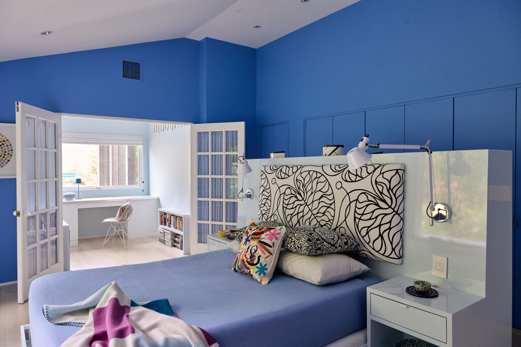
During the build, the grandchildren started arriving, and the space needed to take those curious visitors into consideration. And it needed to be fun! The loft area is one of my favorites. Everything is multi-functional. The L-shaped seating area transforms into a bed and the coffee table surface can be flipped over and used as snack trays. There are drawers built into the steps leading up to the loft that are used for extra storage. The office off the first-floor bedroom—the headboard and adjustable lamps as well as the closet behind it all custom—is still called the “baby’s room” even though the babies are all grown up. With our client’s feedback through every step of this project, we were able to achieve a modern space that would allow for growth—with the art, the grandkids, and the changing needs of our client.
Ironically, the more limitations we have, the easier it is to be creative and to allow for a vision to come into focus. Inspiration comes directly from the needs and desires of the client, and the functionality of the space. That’s why I sit and observe my clients in their home. It’s part of the process because with architecture, the end user is always right!

Mama Mia! An architect journeys to Venice and Milan

By Blog

Forty-two years ago, I was in Venice…for one night. At the time, I was a student and couldn’t afford to spend an entire day there. It was a gift that my dad had given me as a college graduation present – six weeks to travel around Europe.

Of course, I always wanted to go back. I honestly didn’t think it would take me this long! My son (the same son who convinced me that he needed to study photography in Venice for two months when he was 20 years old), Andrew, along with his wonderful partner, Cody, planned the whole trip which also included four days in Milan.


Venice (Venezia)

In Venice, the buildings have been settling for decades, and the only way to really travel is by boat taxi and by foot. There is, understandably, always construction happening in that sinking city, and you can see that there is yellow tape and huge drapings around many of the buildings. This is Venice, after all, and they will never not focus on aesthetics and beauty. It still must be beautiful.

Venice is tiny, and full of tourists, but the locals are dedicated to trying to keep their space. There is a feeling of joy at every moment and every new day was a new experience.

We went on a few tours. One of them was a three-hour food tour lead by a woman who seemed like a typical, eccentric tour guide. She was incredibly knowledgeable about the food and the history of the city. We started drinking at noon. We did some digging later (via Instagram, naturally) and discovered that our tour guide had some other unique identities, not the least of which was as a fetishist who had a thing for painted-on latex dresses.

We toured the Doge’s Palace, an impressive work of Gothic architecture that is a layering of constructions and ornamentation spanning from 1340 onwards. We also took in several architecture exhibits through the Venice Biennale, a yearly celebration of the city’s art and architecture that includes performances and installations. We walked the entire city, and ate, and walked some more, each of us falling in love with the place.

On our last day, I had the mother of all pastries. The sfogliatelle, otherwise known as the “lobster tail” stateside. I needed a nap! But that didn’t stop me from devouring it. I ate my way through this trip because that is how you experience Italy.


Milan (Milano)

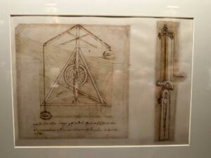
We took a Leonardo da Vinci tour, touring all over Sforzecso Castle, the largest citadel in Europe. We learned about da Vinci’s unique journey and his major impact on Milan. We found out about a Leonardo da Vinci exhibit at the Biblioteca Ambrosiana. It was incredible. The library (Codex Atlanticus Leonardo da Vinci – Veneranda Biblioteca Ambrosiana) had everything, including da Vinci’s notebooks, which were astonishing. His brilliance was particularly evident at the Milan Cathedral, the Duomo, where construction began in the late 1300s. Leonardo da Vinci was one of a long succession of architects at the head of this ongoing project, and at the end of the 15th century was given the Herculean task of designing the tiburio, the polygonal lantern tower that rises above the four arms of the cruciform. It was spectacular.

In fact, every detail was. Cody is an illustrator, and he and I really got off on the mosaics. They were everywhere. Built into the city as a necessity, not a luxury.

We enjoyed a roof tour, walking through the archways and seeing all the gorgeous pink marble up close. What looks like buttresses are just ornamental. They used a very porous marble which means that they are always replacing and doing renovations. There are hundreds, maybe thousands, of individual sculptures throughout Milan, none repeating, including Mussolini and Napoleon and other controversial figures who, it seems, will remain there until they crumble.

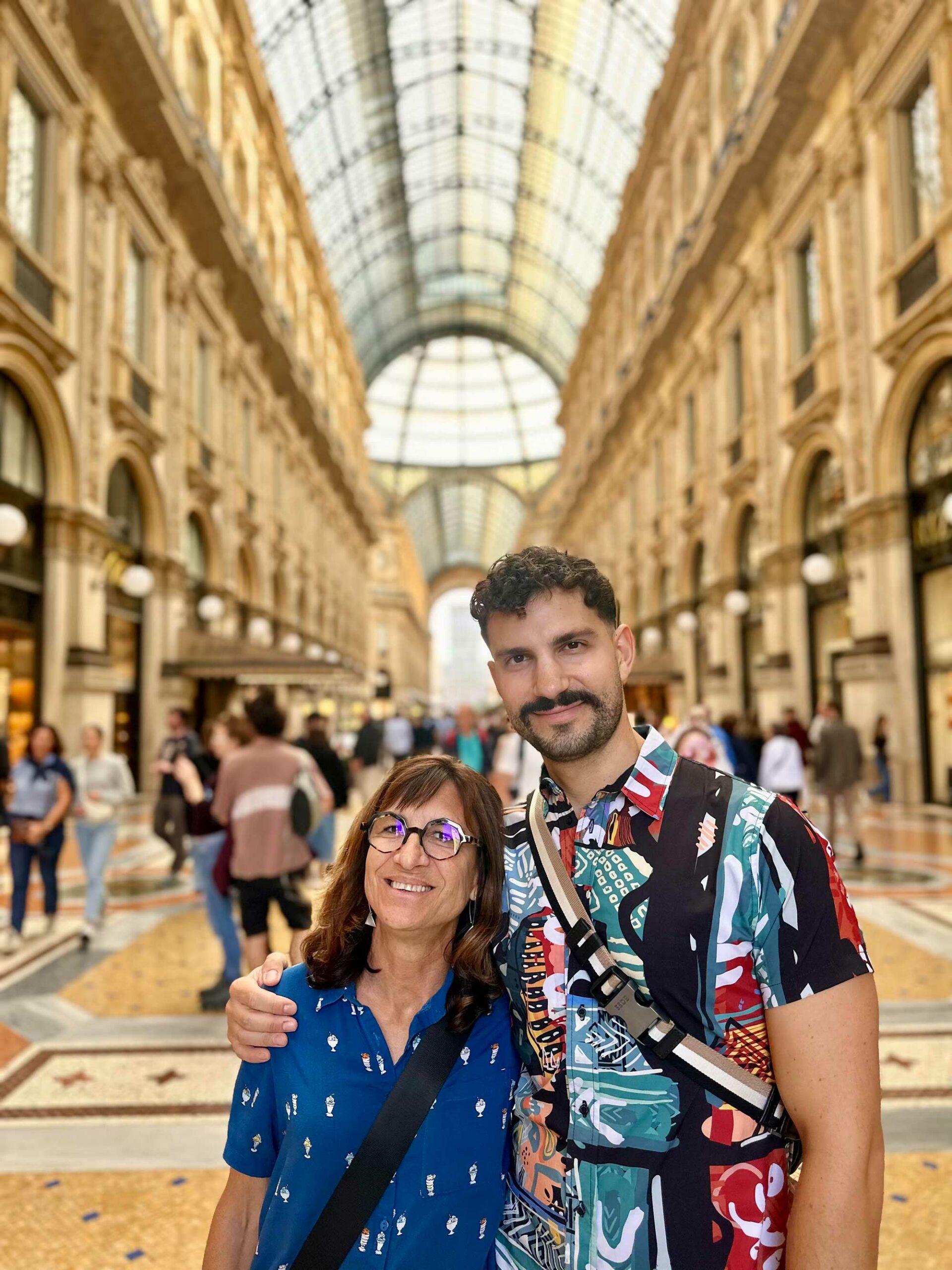
We shopped at vintage clothing stores and peeked into high-end retail spaces like Gucci, Prada, Louis Vuitton. I got in a little bit of trouble –mostly disapproving looks– because I was apparently underdressed for some of the shops! The Galleria Vittorio Emanuele II is a pedestrian mall housed within a four-story double arcade and consists of two glass-vaulted arcades intersecting in an octagon covering the street with an arching glass and cast-iron roof. The Galleria is teaming with high-end couture shops and home to some of the oldest shop spaces and eateries in Milan. We treated ourselves to a visit to Café Aperol, one of the oldest cafes in the city.

Do you know what was really cool? Europeans still shop. It was wonderful to see people out on a weekday, having lunch, shopping. They really enjoy it. Americans don’t shop like that. Not since the pandemic, and not even before that. We’ve lost that culture, or we never really had it.

Italians also don’t take huge breakfasts, but there are always pastries and every pastry I had was better than the previous, and every cup of coffee, too.

The Mama

Young people are so much fun to be with. Several times I’d be taking pictures and it felt like Andrew and Cody were the grown-ups, and I was the kid. We also discovered that the password in Italy is “mama.”

“They’re gonna let the mama pay for dinner!”

“Bring out extra limoncello for the mama!”

I felt like I was put on a pedestal. It was weird, but I did just fine with it. There are very few places in the world that make you feel like Italy does.

Big Sur in the Berkshires

By Blog, Press

Originally published in Berkshire Magazine’s 2020 Winter Issue

PHOTOS: Lisa Vollmer

The Seibert’s

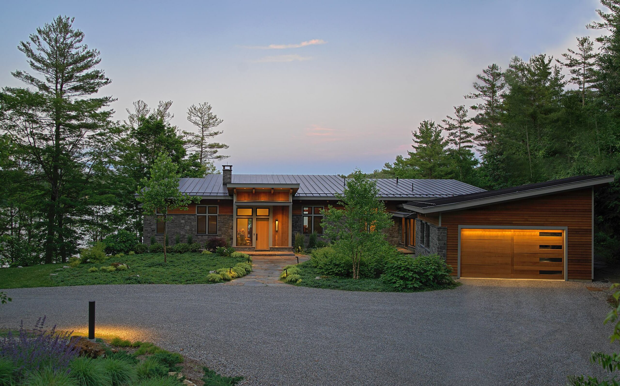
Fred Seibert and Robin Sloane Seibert stumbled upon their Stockbridge home quite by accident. Robin grew to love the mountains while a student at UVM, but Vermont was too far from their residence in Manhattan, and ocean-front homes on Long Island felt too elitist. The couple stopped in the Berkshires on a whim, after dropping their son at college in Maine. They traveled with a shortlist of wishes for a second home: a vista location while avoiding isolation; a house with an open living space; access to a good, local bookstore; and a place within close range of Tanglewood.

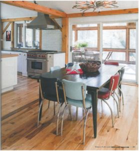
They liked the very first house realtor Tim Lovett showed them, which had a few of the sought-after elements but needed some major changes. Then they met architect Pam Sandler. “If we do this house correctly, we can grow old here,” Robin remembers seeing it. And that’s what they did. After an 18-month renovation, their wishes became reality. The home was transformed into a sanctuary to harbor their creative pursuits, where they could take time away from the city and immerse themselves in the beauty of nature.

The House

The house, a 1970s post and beam, was incredibly dark. Every column and ceiling board on the first floor was stripped to expose the natural knotty pine. Sandler then turned her attention to

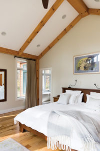
moving walls to create more openness, reminiscent of her clients’ loft in the city. Robin, an avid cook, wanted the kitchen open to the rest of the living area, and Sandler created a proper entrance—one that precluded guests having to navigate a dark mudroom-turned-laundry area. Perhaps the pièce de résistance is the spa-like master suite, an addition that hinges upon a seamless connection between inside and outside spaces. Sandler calls it, “feeling at one with nature,” which is entirely evident through expansive glass on two walls. In fact, the remodel effectively resembles a cabin in Big Sur, where Robin and Fred eloped 25 years ago—a feel Robin was striving for all along.
A key factor in designing spaces for her clients is not only listening to what they want, but also getting to know them and their personalities. “I find Robin and Fred so down to earth,” says Sandler, who opened her architectural business in the Berkshires 30 years ago. “They are not pretentious; they are humble people, and the house had to feel that way.”

Sandler configured the clean, soaring space—effectively combining elements of wood, glass and metal—to include large, open living areas with several intimate niches. The house contains thousands of books, and Fred has a particular affinity for the library niche. (They are also in close proximity to one of their favorite places, The Bookstore in Lenox.) When she is not tackling a culinary feat, Robin gravitates toward her grand piano, a rebuilt Steinway from Flynn Pianos, that takes center stage in the living room.

Backstory

Robin was in the rock-and-roll business for two decades, including a ten-year stint at Geffen Records as creative director. While at Elektra Records, she directed the Cars’ video, “You Might Think” which went on to receive the very first MTV Video of the Year award in 1984. She retired 20 years ago to raise the couple’s two sons—and her timing was spot on. “It’s a changing business,” she recalls. “Rap was coming in, and I wasn’t relating to rap.” Robin promptly switched gears to pursue classical piano and creative writing—regularly attending BSO open rehearsals and recitals in Ozawa Hall, both at nearby Tanglewood.

red has been referred to as the “cartoon king.” He was president of Hanna-Barbera’s cartoon studios in the 1990s. He is credited with discovering Seth MacFarlane, the creator of the TV series “Family Guy,” fresh from college, when he hired him to work on Hanna-Barbera cartoons. Seibert’s biggest audience is online through his Channel Frederator network. Cartoons run on YouTube, but his network promotes them, sells ads and distributes the proceeds to some 2,000 of his video makers. He still serves as executive producer of “The Fairly Odd Parents,” a TV series he began producing in 1998.

In The Berkshires

photos by Lisa Vollmer for Berkshire Magazine

In the Berkshires, Fred likes to stay put. “I’m an introvert in an extroverted business. I need a place where I can recharge,” he says. He has a workshop where he continues to feed his lifelong affinity for building. Pieces of his original design punctuate the home, ranging from wood and metal bookshelves to a live-edge desk; the bench, just inside the kitchen entrance, was the first piece he built for the couple’s Berkshire getaway. He also regularly adds to what he calls “an obsessive poster collection,” many of which are on display throughout the house.

“We agreed we would do what it takes to make it the home we wanted,” says Robin of the enormous undertaking that included exterior landscaping. Save for ripping out the ragweed and goldenrod lining the driveway and planting a row of Hemlocks to screen their addition from the neighbors, the Seiberts let the property sit for two years without alteration. Slowly, Robin began landscaping. With the help of Rob Genarri of Glendale Botanicals, the two worked together carving out more lawn, putting in beds, and creating meandering paths.

Above all else, Robin and Fred exude thankfulness—for having met Sandler and for committing to create a home where they can grow old. “We honor each other’s creativity and respect it,” says Robin of her husband. “As did Pam,” Fred chimes in.

Come Christmas, the Seiberts’ two sons will join them in Stockbridge. Joe, 24, is earning a PhD in physics and Jack, 22, a programmer at a video game company, will both make the trip east from California. Holiday traditions include venturing to Seekonk Tree Farm in Great Barrington to select and cut a tree, walks in nature, and skiing for Robin and her sons at Ski Butternut. “It’s fantastic,” says Robin of this cherished time together.

Breaking the rules in Greece

By Blog

I first had the opportunity to travel to Greece when I was about 21. In the summer of 1981, as a graduation present from my father, I travelled around Europe. I met an art historian in Rome. It was the last stop in my journey, and he asked me, “You wanna go to Greece?”4

Of course, I wanted to go!

“I can’t,” I said. “I have to get a job.”

I didn’t go to Greece.

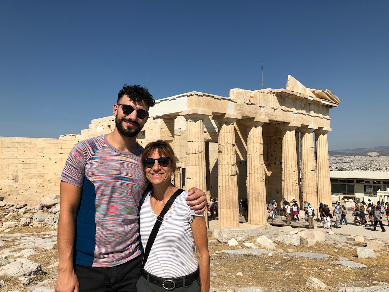
That was nearly 40 years and three kids ago. Last month I finally made the trek (the flight is longer than you think) with my son.

Of course, we toured the architectural essentials: The Acropolis, the Parthenon, so many museums. Visiting the Palace of Knossos in Crete gave me chills, just knowing that the site was settled before 6,000 B.C. Many monuments and buildings were undergoing major structural repair. At these structures and even smaller spaces and residences, I saw the gold star of historic preservation. It also became obvious, while marveling at the layers of structures all over the islands, that I was seeing the bedrock of the fundamental rules of architecture.

The monumental history and beauty of Greece is matched, and balanced, by the people who inhabit the islands. Everywhere we went, locals implored us, “Relax.” Forever reminding us that it was time to slow down and take in the entire essence of their beloved sights. And to eat! The food in Greece is unreal. Stuffed eggplant, octopus, fresh sardines, tzatziki…I’m not a big eater but…there is nothing more important than food to my son. He would find places for us to eat and snack (the benefit of having a phone and a million food review apps), and we were never disappointed. We tried everything there was to try. I could taste the Turkish influences in the spices and preparation of the food. Wine is the least expensive thing on the menu, and it is good wine and plentiful.

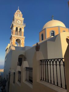
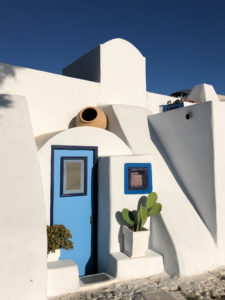
Color is also abundant. Everyone talks about the opulent blues and whites of Santorini, but to see it in “real life” is extraordinary. The sea is a canvas for the white stuccos and blue sky. There are no rules in the architecture there. Really modern design lives side-by-side with older structures, and there are layers of it, each trying hard to work with the landscape of that gem island.

Strangely, or perhaps naturally, there is no shortage of graffiti, especially in Athens. My son is a graffiti connoisseur, and he was immediately drawn to the street art, which was strongly cultural in the sense that the clandestine artists spray-painted modern renditions of gods and goddesses and other national touchstones on the stucco walls and marble columns and shop gates all over the city. It made me cringe a little…the ancient marble (there is marble EVERYWHERE) covered over with political messaging, obscenities, and graphic novel icons. Yet, it fits. The whole thing makes sense. New. Old. Modern. Classic. Ruined. Rebuilt.

$300 and a Dream

By Blog

I had $300 in startup money when I first went into business. At the time, $300 was a lot of money! For me, it meant that I had the freedom to create something very special. As a young woman architect—which was rare in 1989—hanging my shingle in the quaint Western Massachusetts town of Stockbridge (home and inspiration to illustrator Norman Rockwell) was a proud moment. More than proud. It was THE moment for me, where I shut out the tiny, annoying choruses of self-doubt, and realized that my dream of “Pamela Sandler, Architect” was a tangible reality.

Of course, making dreams a reality requires a lot of work. Saying “yes” to just about any job that came down the pipeline during those early years was a must. In the years leading up to opening Pam Sandler AIA, I took on a lot of different jobs. One of my first jobs was designing a house in New Hampshire that had a stone wall running through it. I met the client at the hardware store, and I think I made $8 an hour on that job, but I was so thrilled. I once designed an oven exhaust hood for a Chinese restaurant to gain experience and money.

Pamela Sandler – doing what it takes to get the job done.

That’s how I got started. Most small business owners know that you do whatever it takes.

I designed a house for Tom Hoadley, the famous potter, and his wife Stephanie. He said, “I know exactly what I want,” and as he was talking about the design, I drew a sketch of what I thought it should be and put it in my pocket. Just a sketch. The whole house was a well-insulated cube, and I knew that the only way to change the interior space was to put everything askew, to not feel like one was living in a box. Tom was thrilled with outcome. He still lives in that house!

Pamela Sandler – the early years.

Along that path, those small design and sometimes odd jobs, I discovered the solid foundation of my mission: I want to bring my clients joy. The kind of joy that is the result of communication and a lot of conversation, and really getting to know who my clients are and how they live in their particular space. In fact, before I do any work for a client, I visit their primary residence. It may not be the space they hired me to design, but it is the space they live in day to day. People can tell me how they live, but in order to truly understand and feel the way they live it’s something an architect must see and experience.

Once I was visiting a client couple in their home in Philadelphia. The husband was a psychiatrist. I walked through their entire home, really running my hands over the place—you have to get personal with the space! As I was doing this, he was watching me, a little frustrated. Once he realized what I was doing, trying to get a real feel for the space he and his family called home, he relaxed and said, “Now I understand how personal you will get when working with us.”

I mean it. Whatever it takes to bring joy.